Brian Jones – Speedway Originals Poster
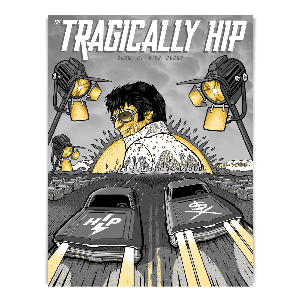
New “Hip Original” poster inspired by Blow at High Dough. This 80 lb uncoated cover stock printed lithograph takes inspiration from our song “Blow At High Dough”, and Brian was sure to include many hidden lyrical references.
P.S. Gord dressed as Elvis takes inspiration from a very real photo… Do you recognize which one?
Specs: 80lb uncoated cover stock printed lithograph – 18” x 24”
Brian’s bio:
Brian Jones is an Illustrator…born, and raised in Toronto, Canada. As a young aspiring artist he was very influenced by music.
All types of music, but something about 80’s thrash metal, Wow!! The Heavy, the Loud, and the Skulls, a perfect storm.
Skateboarding culture, Tattoo culture, and album cover artists in the heavy metal realm cemented his path forward from there.
Serious influences include Derek Riggs, H.R Giger, Salvador Dali, and lastly “God” himself….Pushead.
As a teenager, Brian attended a High School with a great art program and went on to study Classical Animation in College. Which was an incredible tool for thinking in 3D, and using perspective to create depth. From there, he branched out as a creative does, and became very involved in the apparel screen printing business. Keeping focus in designing art/logos for bands and working with apparel companies with branding, and apparel design work. Yada, Yada, Yada…It’s 2023. Pushead is still “god”, and hopefully he is still getting better, and better as an artist.
For this project with The Tragically Hip “Blow at High Dough” poster, reading through the lyrics and listening to the song again, I kept getting this old black and white movie “Rebel without a Cause” vibe. I have never done a “look” like that, so I figured “why not ?” That typical old school drag racing scene where the tension builds and builds, as the cars barrel faster and faster down the track !! The loaves of bread lining the track with headlights ??…I have no idea how I came to that but I think it works 🙂…and of course, there has to be some reference to “some kinda Elvis thing” right ? Originally, I went with an “Elvis”, but in the end a “Gordis” better suited the design.
